1、view
相当于div ,是一个块级元素
由于代码高亮的显示,本文中 html 代表 wxml ,wxss 代表 wxss
1
2
3
4
5
6
|
<scroll-view class="container1" scroll-y>
<view>A</view>
<view>B</view>
<view>C</view>
</scroll-view >
|
1
2
3
4
5
6
7
8
9
10
11
12
13
14
15
16
17
18
19
20
21
22
23
24
25
26
|
.container1 view{
width: 100px;
height: 100px;text-align: center;
line-height: 100px;
}
.container1 view:nth-child(1){
background-color: aqua;
}
.container1 view:nth-child(2){
background-color: blueviolet;
}
.container1 view:nth-child(3){
background-color: chartreuse;
}
.container1{
display: flex;
justify-content: space-around;
}
.container1{
border: 1px solid black;
width: 100px;
height: 120px;
}
|
3、swiper 和 swiper-item
- 轮播图容器组件 和 轮播图
item 组件
- 轮播图是
滑动转换的
1
2
3
4
5
6
7
8
9
10
11
| <swiper class="swiper-container">
<swiper-item>
<view class="item">A</view>
</swiper-item>
<swiper-item>
<view class="item">B</view>
</swiper-item>
<swiper-item>
<view class="item">C</view>
</swiper-item>
</swiper>
|
1
2
3
4
5
6
7
8
9
10
11
12
13
14
15
16
17
| .swiper-container{
height: 150px;
}
.item{
height: 100%;
line-height: 150px;
text-align: center;
}
swiper-item:nth-child(1) .item{
background-color: brown;
}
swiper-item:nth-child(2) .item{
background-color: skyblue;
}
swiper-item:nth-child(3) .item{
background-color: gold;
}
|
4、text
添加 selectable 属性即可,是布尔值,默认 false
1
2
3
4
| <view>
长按选中效果
<text selectable>123456678</text>
</view>
|
rich-text:通过nodes属性节点,将THML标签渲染为对应的UI结构
1
2
| <rich-text nodes="<h1 style='color:red;'>标题</h1>">
</rich-text>
|
1
2
3
4
5
6
7
8
9
10
11
12
|
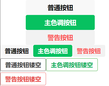
<button>普通按钮</button>
<button type="primary">主色调按钮</button>
<button type="warn">警告按钮</button>
<button size="mini">普通按钮</button>
<button type="primary" size="mini">主色调按钮</button>
<button type="warn" size="mini">警告按钮</button>
<button size="mini" plain>普通按钮镂空</button>
<button type="primary" size="mini" plain>主色调按钮镂空</button>
<button type="warn" size="mini" plain>警告按钮镂空</button>
|
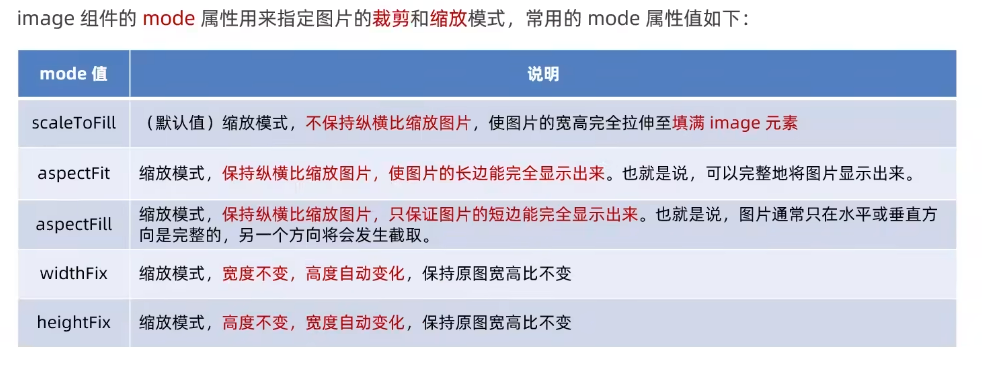
6、image
图片属性